

First impressions are important.
The first impression people get from you when they land on your website’s homepage has many of the same elements as a first date.
People make snap judgments about you and what you have to offer based on first impressions. So, like you would on a first date, you’ve got to put your best foot forward on that homepage.
Maybe you’ve experienced this before…
Have you ever been on a first date with someone who tells you their whole life story in the first 15 minutes?
It’s a little off-putting.
In the same way, you don’t need to tell your audience everything about what you do and who you are on that first page. You only need to tell them enough to interest them in clicking to another page.
This means, for example, that you don’t lead with, say, a press release or a “news” column. You’re not there yet in the relationship. Do you enjoy a date where the other person rambles about themselves for the entire evening?
Don’t be that person.
What visitors see when they first land on your homepage will tell them whether you are fun, edgy, stable, professional, progressive, conservative, or some other exciting adjective, depending on your messaging and the page’s visual aesthetics.
You don’t want a website that announces: I’m stuffy, outdated, uninformed about issues in my industry, and generally someone you don’t want to follow. People will subconsciously apply these attributes to whatever product or service you offer.
Four guidelines to apply
We’re here to save you from that bad first impression with four guidelines to apply when building your homepage.
First, DEFINE the personality and tone of the website.
Here’s a question we ask during the discovery process with a client:
How do you want people to feel when they interact with your brand? Safe and secure? Edgy and excited? Exclusive and cool? Like they belong?
Take some time to think about this for yourself and your business.
Maybe you want a slightly more professional tone on your website but would prefer to let your hair down a bit on your social media channels. It’s up to you. Whatever you decide, write it down.
Once it’s down on paper, as simple as that is, the course will be set for the tone of your narrative and the types of photos you use.
Second, CRAFT the words that will provoke a second glance.
Before designing any website, you’ve got to know what it needs to say. Start crafting the words before you begin building that homepage. This is crucial. Don’t jump ahead to the building phase—as tempting as that is. (Guilty.)
The messaging on your homepage must persuade the audience that your product/service offering is exactly what they need. It should evoke emotion in some way—humor, compassion, confidence, surprise. Take your time to ensure you get this part right!
Check out the header image from this site below. How lovely is her messaging from the moment you land on her homepage?
My name is Annie Cushing, and I make data sexy. I’m so passionate about making data sexy, I literally wrote the book on it. My forte is gathering, analyzing, and visualizing marketing data of all types. I find the story it’s trying to tell and deliver insights and strategies from it. I have to talk about it on my blog because no one wants to hear about it at parties.
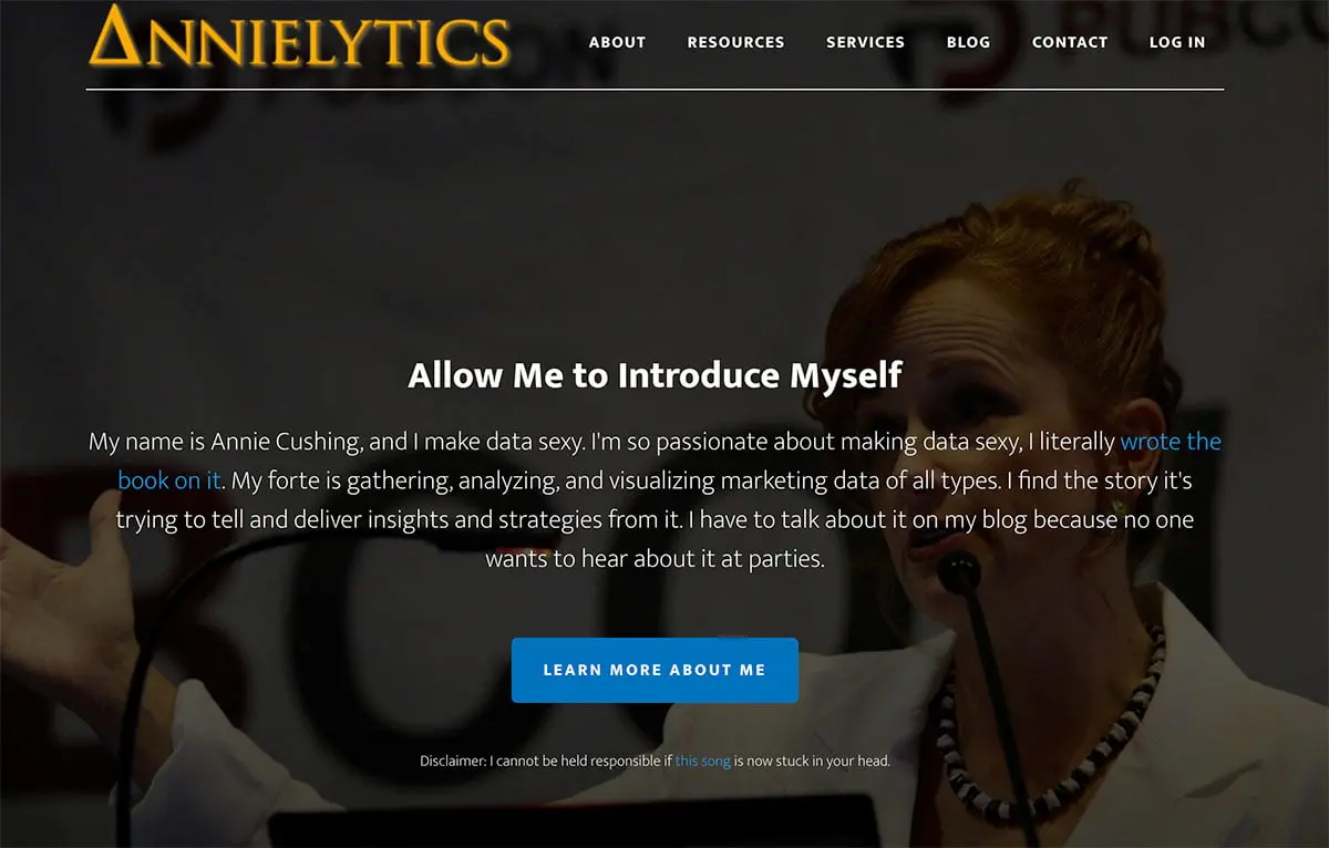
Source: annielytics.com
If you want to learn more about web analytics, tell me her intro doesn’t entice you to click on the next page.
Third, use design and imagery to DELIGHT the senses.
Create an experience. To look good, you don’t need complexity. Design can be simple and classic.
Take another look at Annie Cushing’s header image above. She used a photo of herself speaking and added an overlay. Simple and powerful. It looks great. (For more on using images on your website, check out last week’s post here.)
You want to accomplish two things with design:
- Tell the story of who you are.
- Delight the senses so people keep moving through your website to learn more about you.
Spend time exploring other websites for inspiration and be aware of what draws your attention.
I keep a private Pinterest board filled with websites I like. When I come across websites that catch my eye, I’ll use the “Pin It” button on my bookmarks bar to capture the site. Then I note in the caption area of my “pin” what caught my eye.
For example, I came across the website below the other day and was captivated by the imagery.

Source: bikepacking.com
These photos beckon beguilingly to those interested in bike-packing. The entire site is filled with gorgeous photography. There is no question that this is a go-to site for learning more about bike-packing, including the discovery of new routes and gleaning great insights from the web creators’ experience and expertise.
Not only does this homepage convey an immediate sense of authority in their area of bike-packing, but it also generates trust. If I were in the market, I would be comfortable purchasing from them because I perceive they know what they’re talking about.
Fourth, CULTIVATE opportunities to keep the relationship going.
Once you’ve done the hard work needed to draw your audience in, offer multiple opportunities for people to continue to connect with you.
For example, provide a way for visitors to subscribe to your email list. One way to do this is to create a popup that appears just as someone is leaving your site or provide easily accessible forms for the visitor to opt-in to future communications. The important thing is to engage as many people as possible.